Wirecast
Designing an ergonomic solution for podcast-listening
With more than half the U.S. population listening to podcasts and an age bracket in the 20-30 years old, podcasts, while becoming increasingly popular, don’t have the same digital backup than more traditional medias like music and videos have.
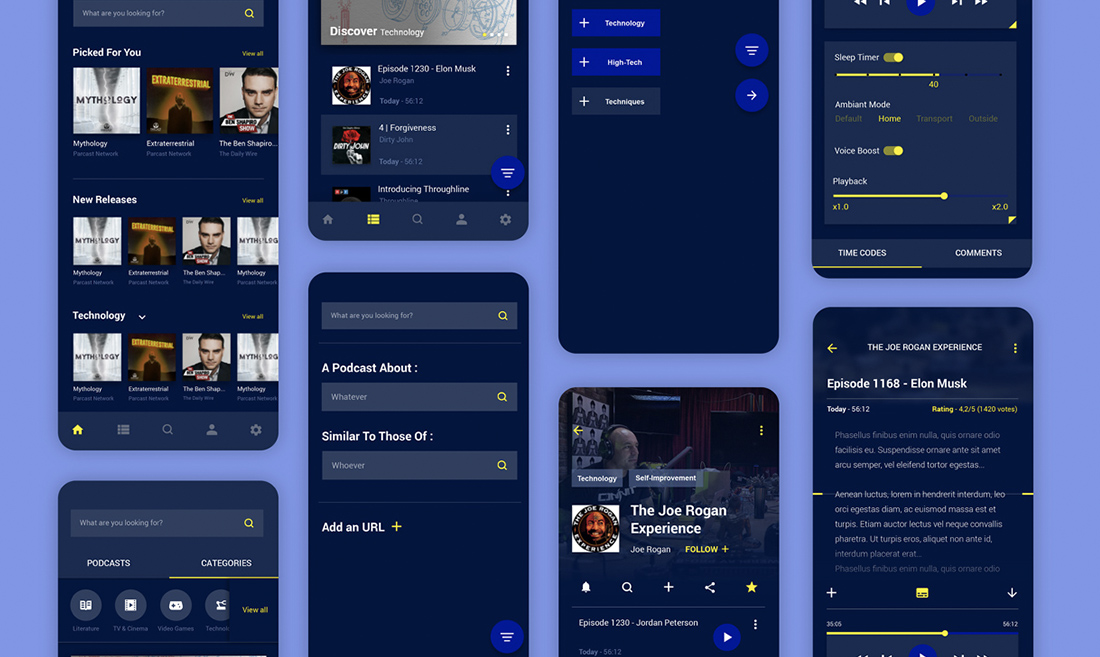
Podcasts applications aren’t typically elegant, but I realized that to truly engage users, it needed a distinctive identity and an appeal while retaining functionality. The aim was to enhance and complete the experience of podcast-listening. Wirecast would be a solution of reference, aiming to offer greater ergonomy and interactivity than the several more dispatched and independent applications.
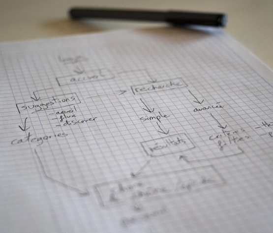
After researches about the podcast audience and the evolution of this media, it turned out 94% of podcasts listeners were active on social media, and that there were many contexts in the listening of a podcast, from commuting to relaxing, even while working. The potential users became pretty obvious and were manifested into personas.
Since the podcast is still a niche domain, the existing services and applications don’t necessarily share the same codes and functions, resulting in possible confusions for a new user. Wirecast not only must be useful to the usual listeners, but also build on this potential target audience and be an eventual go-to for newcomers.
By consolidating affordances and building on functionnality and identity, the intention is to leave a stronger mark.
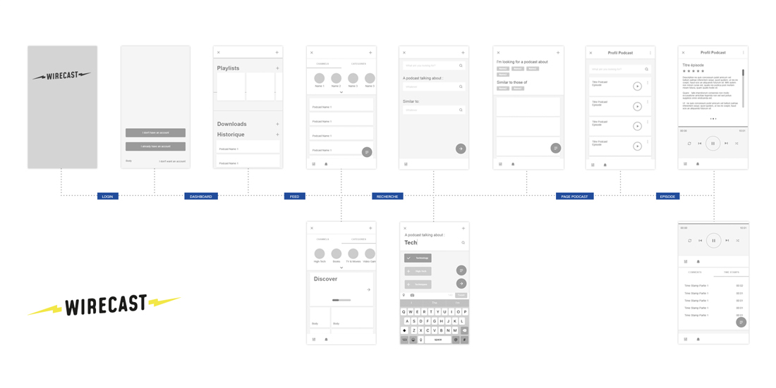
To define users’ goals and potential functionalities, users cases were created. The prototyped process goes from the login stage to the user’s selection and experience of a podcast episode.
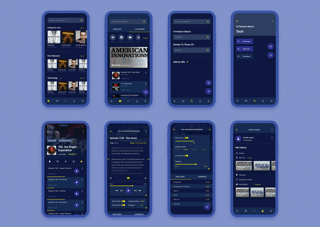
To bring a more accurate management of the content favored by the user, I included the creation of playlists for podcast episodes, and lists for shows, access to a history as well as user favorites. Simple tools of classification allowing the creation of one’s own podcast library.
A more intuitive way of searching for specific content, to easily find a podcast or a creator’s channel according to similarities and topics, or to simply add a link. The user can base his search on similarities with his following and on specific topics of interest.</div>
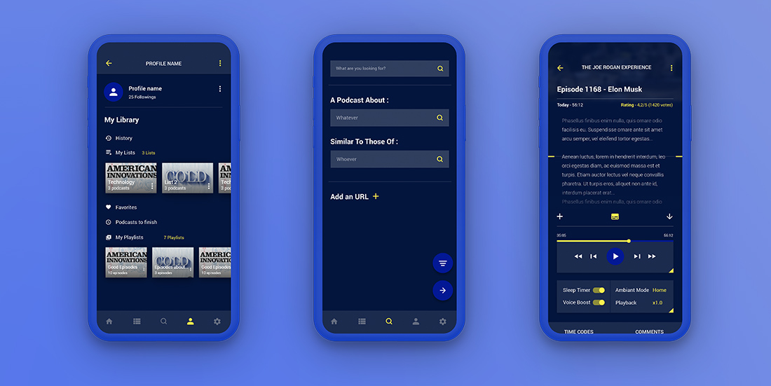
A direct access to the links and websites of the creators he follows, and a possibility to rate and interact with the podcast itself brings a stronger aspect of community and interaction.
To enhance the listening experience, audio parameters were included to configure playback speed, ambiance mode according to the external environment (transport, interior, etc.), or a sleep timer. Access to transcript and times codes provided by the community of the creator, or the creator himself.</div>
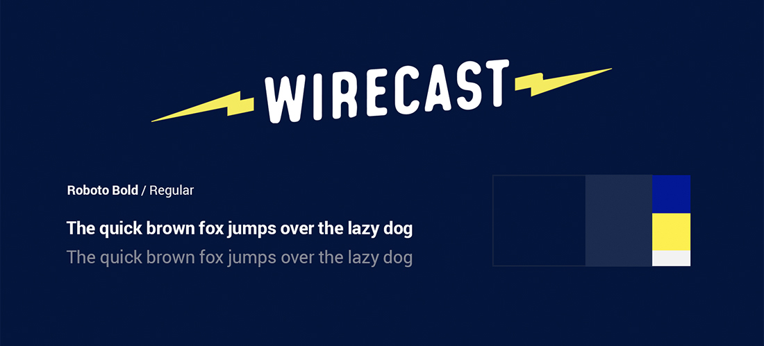
The lightning is a nod to an era of the past but also suggests speed and fluidity, it is an everlasting symbol.
Wirecast’s visual identity is sleek and straight-forward, unassuming yet recognizable enough with a modern color palette of dark blue and bright yellow. The lightning is a nod to radio broadcasting and a sign of dynamism the concept aims to reach. The social functions help to connect the users and the creators the way most modern media do, and it benefits the format itself. This project shows how much untapped potential lies in podcasting, but the similarities with other prevalent online media raises questions about its true place. Where does podcasting stands between live-streaming and video content creation ?
