École Saint-Éloi
Create a visual identity for a local catholic school
The St-Eloi Elementary School is a small catholic school with a locally-oriented scope. As such it doesn’t have the means to have a visual identity that stands on its own, despite being a place that stood the test of time with a lot of history and a genuine approach to education.
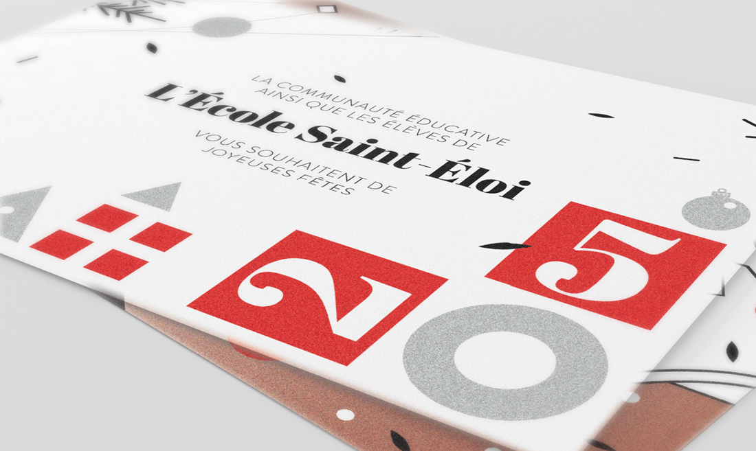
The aim of this project was to faithfully represent the values of this catholic school, with visual branding as a way to mordernize and differentiate it from other schools, while still having its purpose at the center. It was important to create an identity rooted in the dimension of primary education, reminding of a place of learning and development. The parallel creation of a Christmas made earlier served as a prototype to this branding project and helped to reflect the image of the school.
Visually representing values, going from words to visuals.
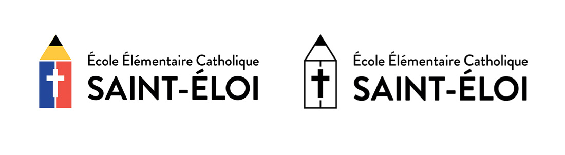
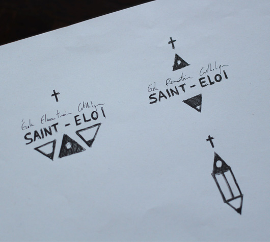
By finding the keywords defining the school, what it represents and stands for, we are able to synthesize its values and aspects to highlight. From these words and definitions, it became possible to start working the school’s visual identity with a draft. To drive home the message and the purpose of the school, I went with basic geometric elements and flat primary colors, relating to early development, the roots of learning and construction games.
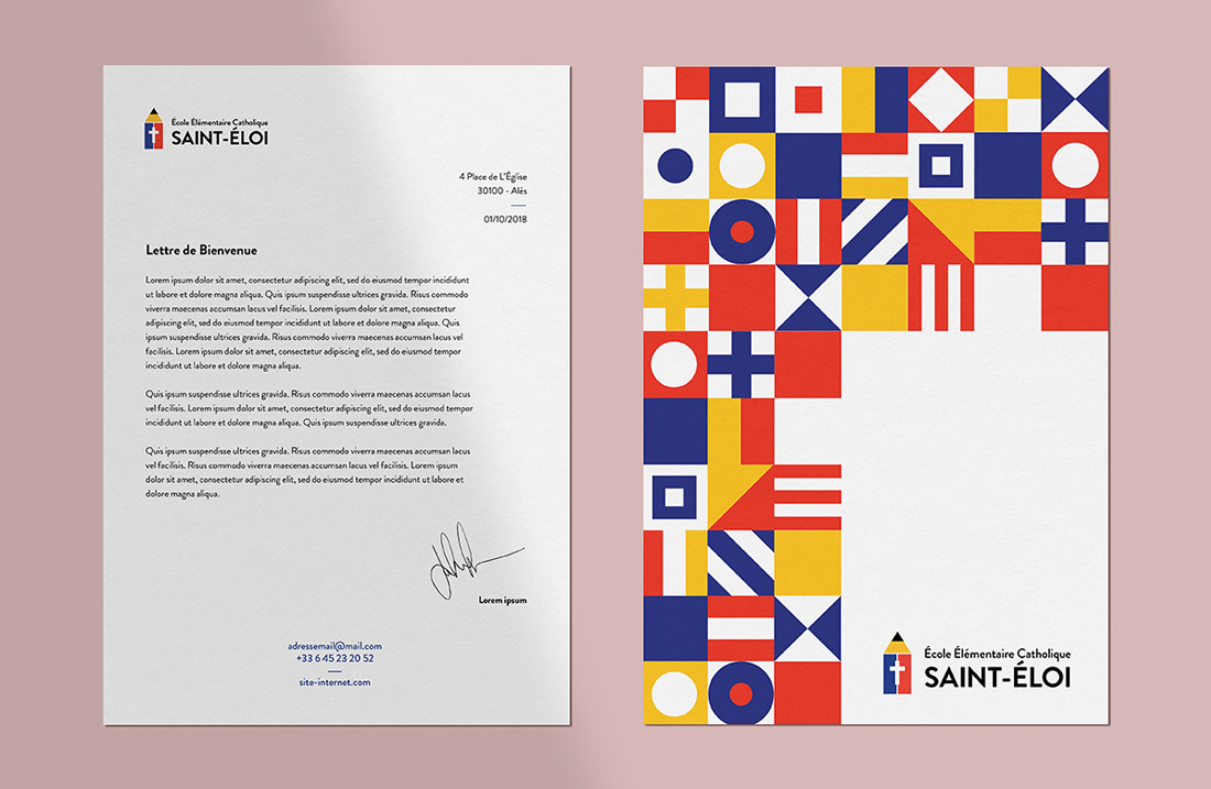
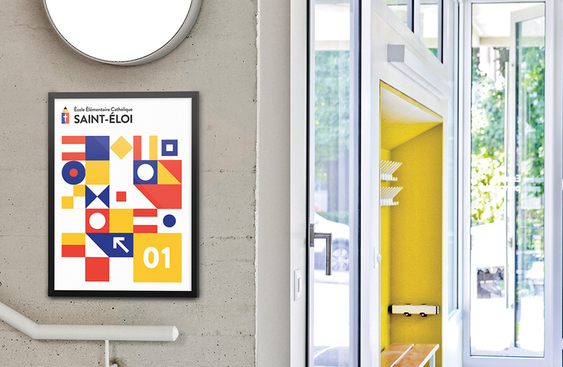
After the graphic principles were defined, they were applied to a logo, then to a pattern system that could be easily declined on different supports. The combinations of simple shapes and colors bring back to elementary education and emphasize the importance of the individual from an early age.