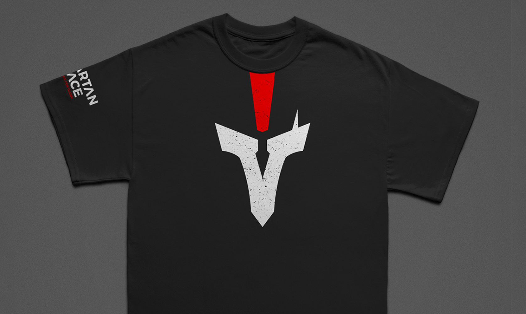
Spartan Race Logo
Creating a logo while staying true to an established brand
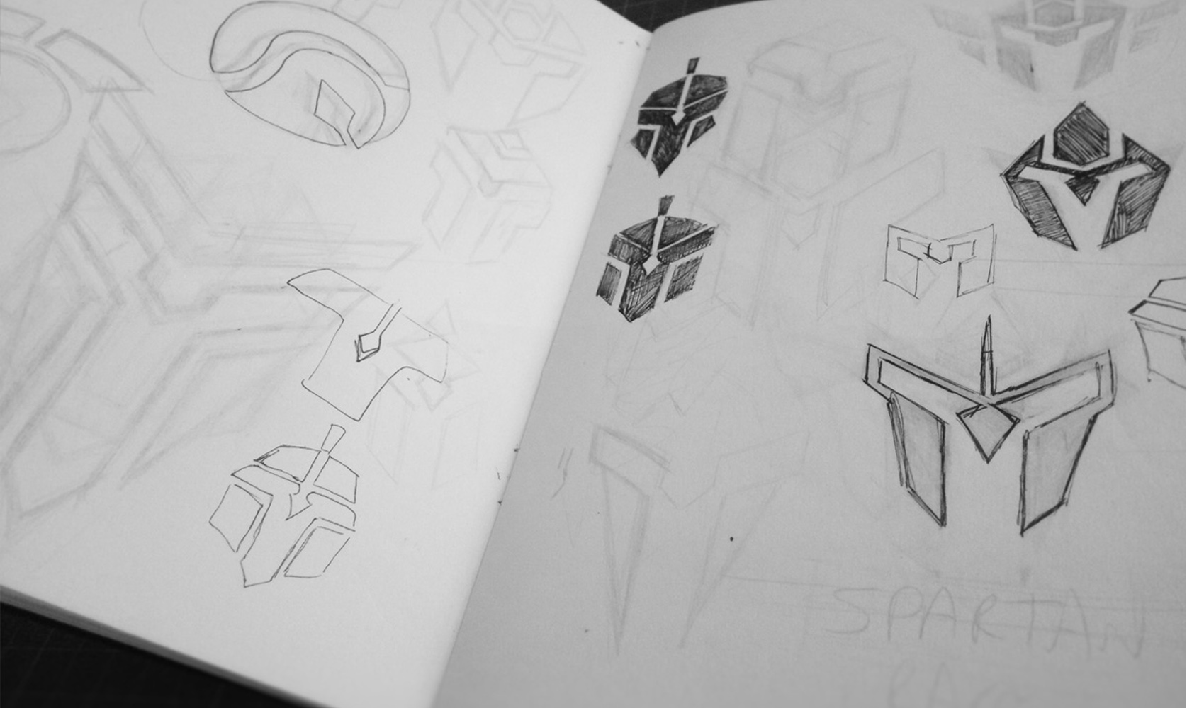

This project consists of a Logo redesign, it was made in the context of an unofficial competition with the Spartan Race an a subject. The use of negative space, as well as the mandatory limit of 2 colors allowed the integration of classic symbols, bringing back to the vigor and power of the Spartans.
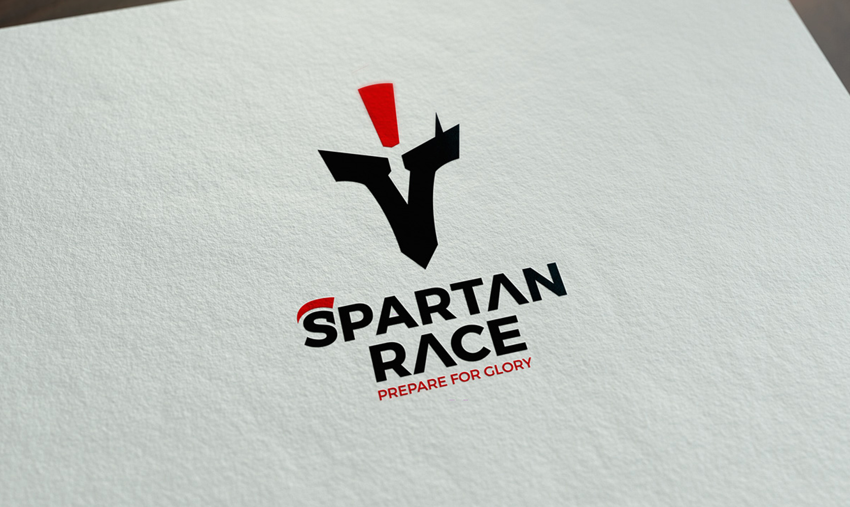
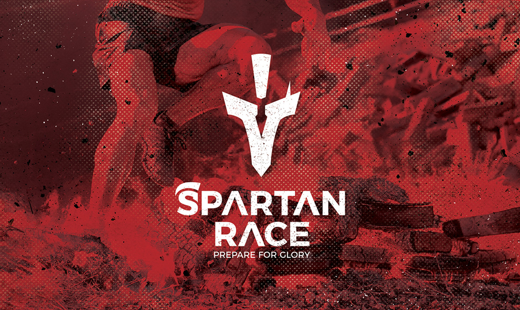
The final simplicity of the shape of the logo aims to make the idea of the spartan race concrete, a testimony of physical prowess.
