MorgenTime
Giving users the agency to curate information
Information overload is a problem of today directly related to modernity. It can be difficult to find what one is looking for in a sea of articles, videos and images that may not be relevant to what an user seeks. Readers usually seek to learn about current events, whether general or specific to their interests, a good platform should allow them to find topics for conversation, learn or simply take care of themselves. Information doesn’t have to be a burden, but it still needs to be personally curated, as the user should be responsible for what he consumes.
This personal project aims to design a modular interface for a news feed. Its purpose is to give agency to the user in curating his flow of information and not to be encumbered by noise, thanks to a fully customizable “newspaper” and a feed that adapt to the user’s manipulation.
It was important to define a target to know how a potential user would operate. Then it became easier to find out how this target discovers information. I defined the target as someone who is able with modern technologies and thus more inclined to be exposed to many forms of media. Case scenarios have also been made to better contextualize the project and understand the process involved. The choice was to adapt the interface to smaller devices to prioritize mobility.</div>
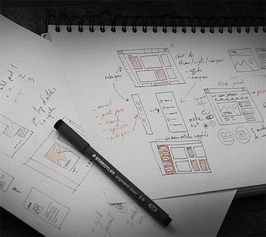
Giving agency and thus responsibility in the consumption of information media.
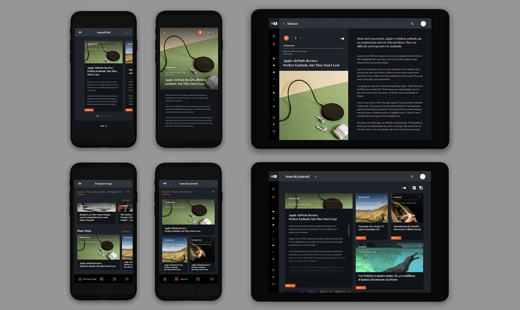
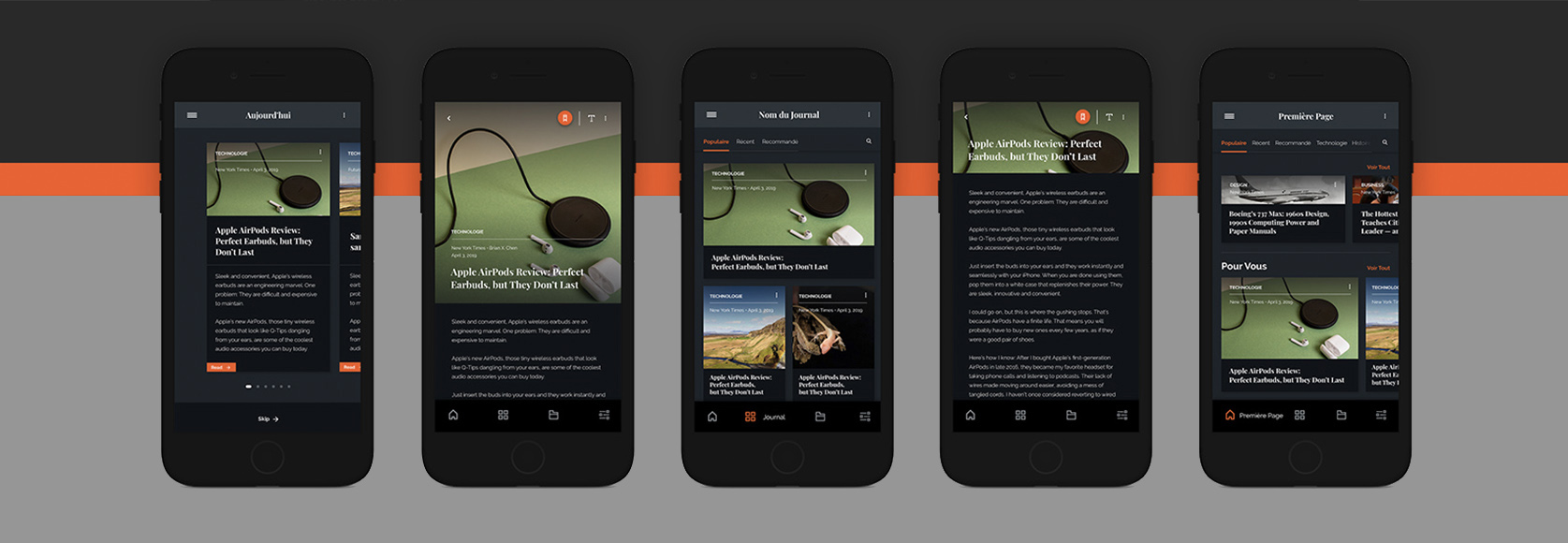
Each article is represented as a block, eventually resulting as a grid. I used a principle similar to Atomic Design to first design the block itself and then the environement he is in. It was an approach who aimed to go from micro to macro in order to keep a structure similar to a classic journal , while allowing a smooth navigation because of the use of common affordances and a Masonry layout.
At launch, a brief retrospective of current relevant articles that may be of interest are shown to the user. This allows them to quick access to the content they are interested in withoutspending unecessary time. The block extends to show the article’s content.
</div>
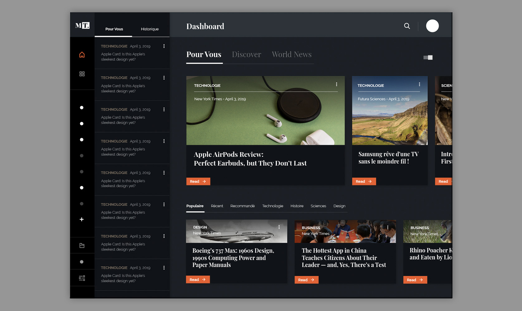
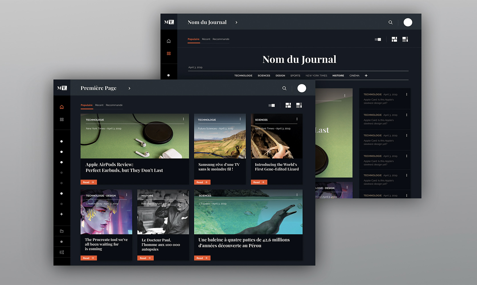
It then arrives at the dashboard of the application. This part offers him a condensed set of articles selected for him and a way allows him to discover new sections. This is the central point of the interface where most features are accessible.
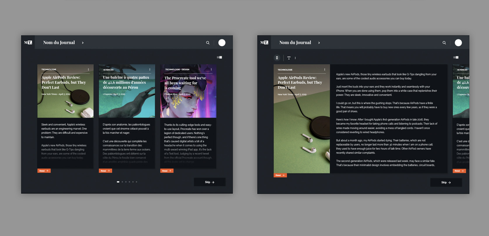
It is possible to create a journal and customize it by selecting the sources and sections that would appear in it and eventually giving a name. 2 display modes are available, a default mode and a log mode that takes a more traditional layout print-inspired.</div>
