Follow The Camino's Interfaces
Helping customers reconnect with themselves
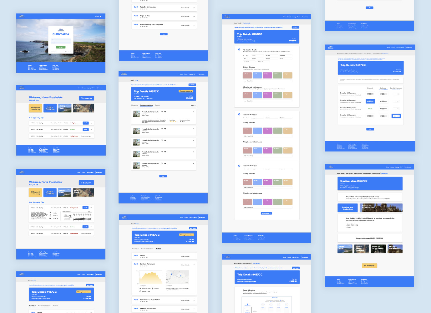
For over a decade, Follow The Camino has been giving its customers the possibility to take break and rekindle their souls with the planning of walking and cycling holidays. However their interface used by customers to plan their booking and pay needed a revamping to be more welcoming, and to promote a wider and autonomous use to those concerned.
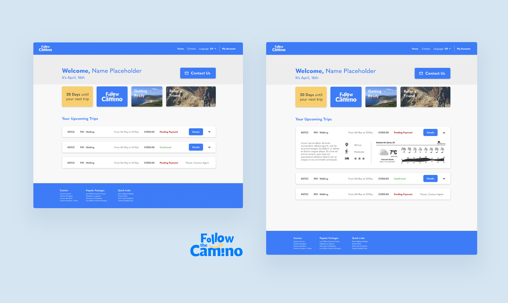
With a customer base of mostly people in their 50s or even 60s, the Client Area previously had the problem of being too austere and unclear. Ultimately the goal is to make it what it’s meant to be, an interface where the client can confidently plan for him and his trip partners, but also be informed about his upcoming walking holiday. If the Camino is all about wellbeing, the interfaces Follow The Camino customers use should refect that and feel rewarding.

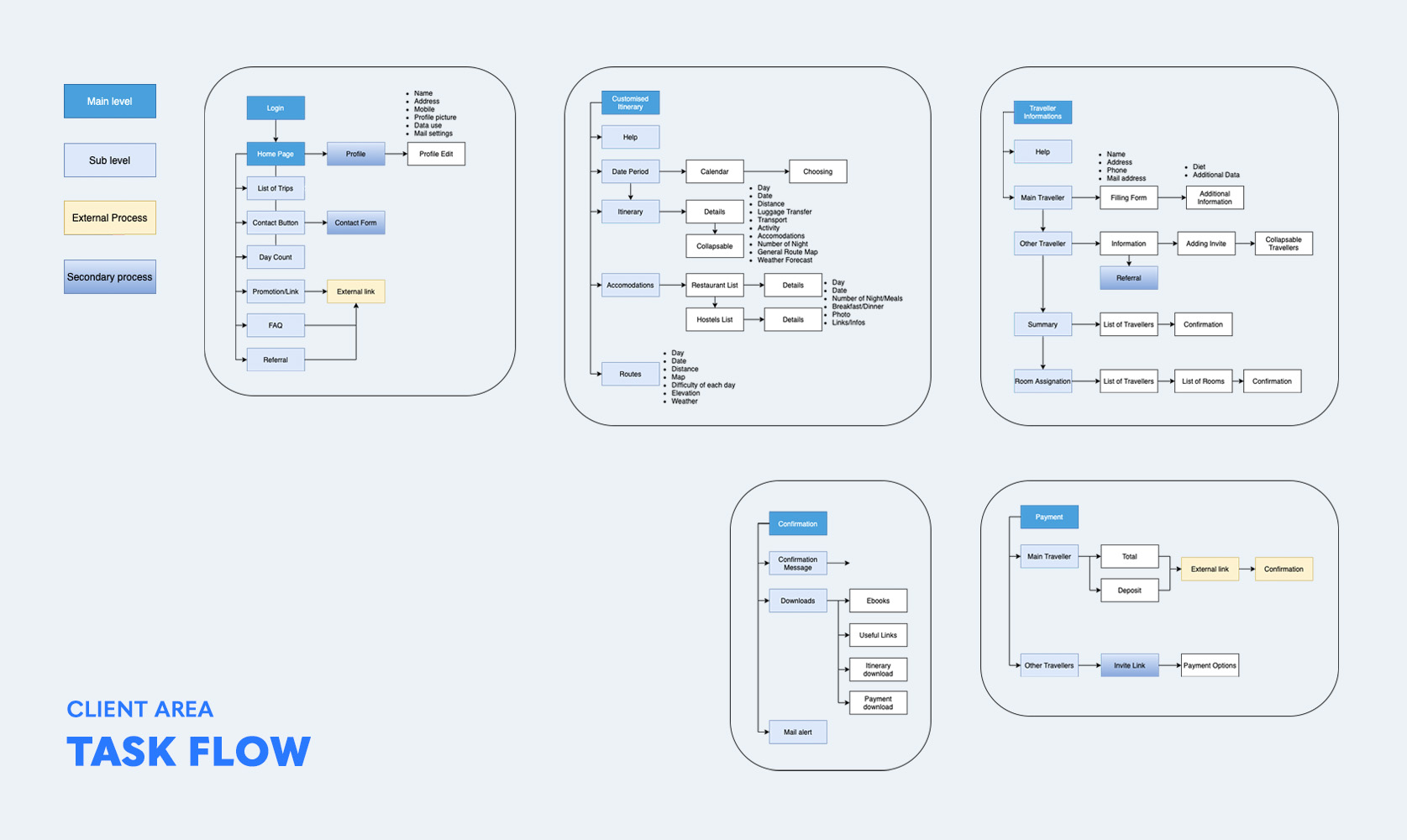
Simply changing the CSS wasn’t enough, the process needed to be streamlined while not alienating previous and recurring users. After studying FTC’s buyer personas, I decided to focus on specific pain points. To do so, I directly worked from the Client Area’s User-Flow and created a new one.
This new User Flow aims to stay faithful to the previous process, which was functional, while improving on it. The new process gives more possibility for an autonomous use for someone less used to digital interfaces and give control and security to the customer.
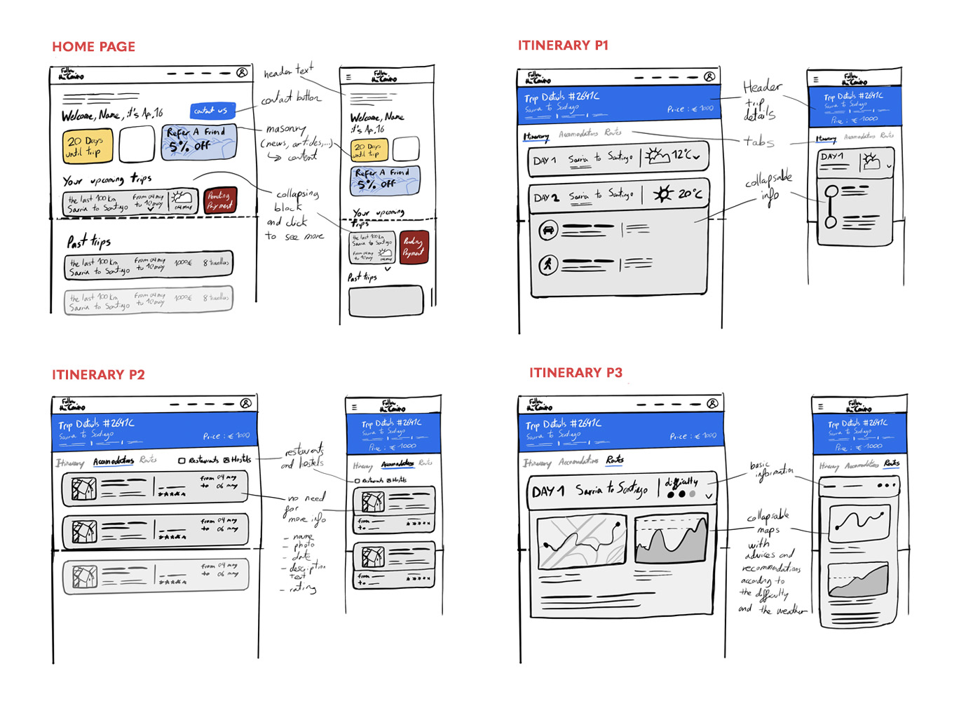
Sketches were made and I quickly focused on building the interface with blocks. Since the Client Area doesn’t need to be cluttered with infornation, it gives more freedom to use the layout space. The customer has more time to take in the information.
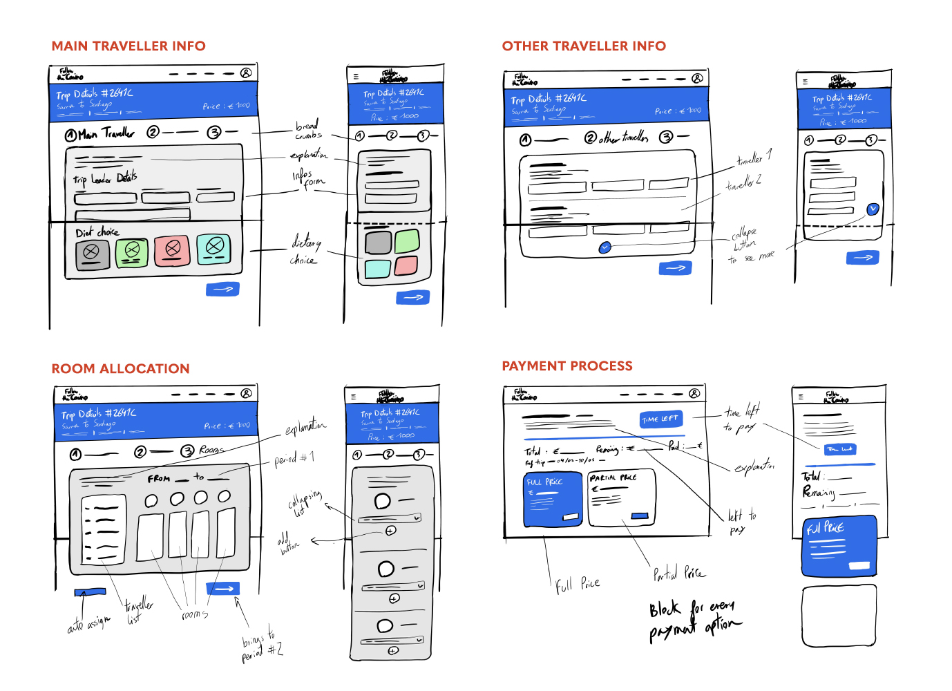
There was the opportunity to integrate the FTC brand in the Client Area, through the UI and by linking it to the website with links and articles placed in the process. The use of blocks is here to showcase important elements, and to help with hierarchy and directing the user where he needs to go.
Working with developers made me nore attuned to the needs and process related to development, I had to take into account the structure of the code and how the interface would be built.
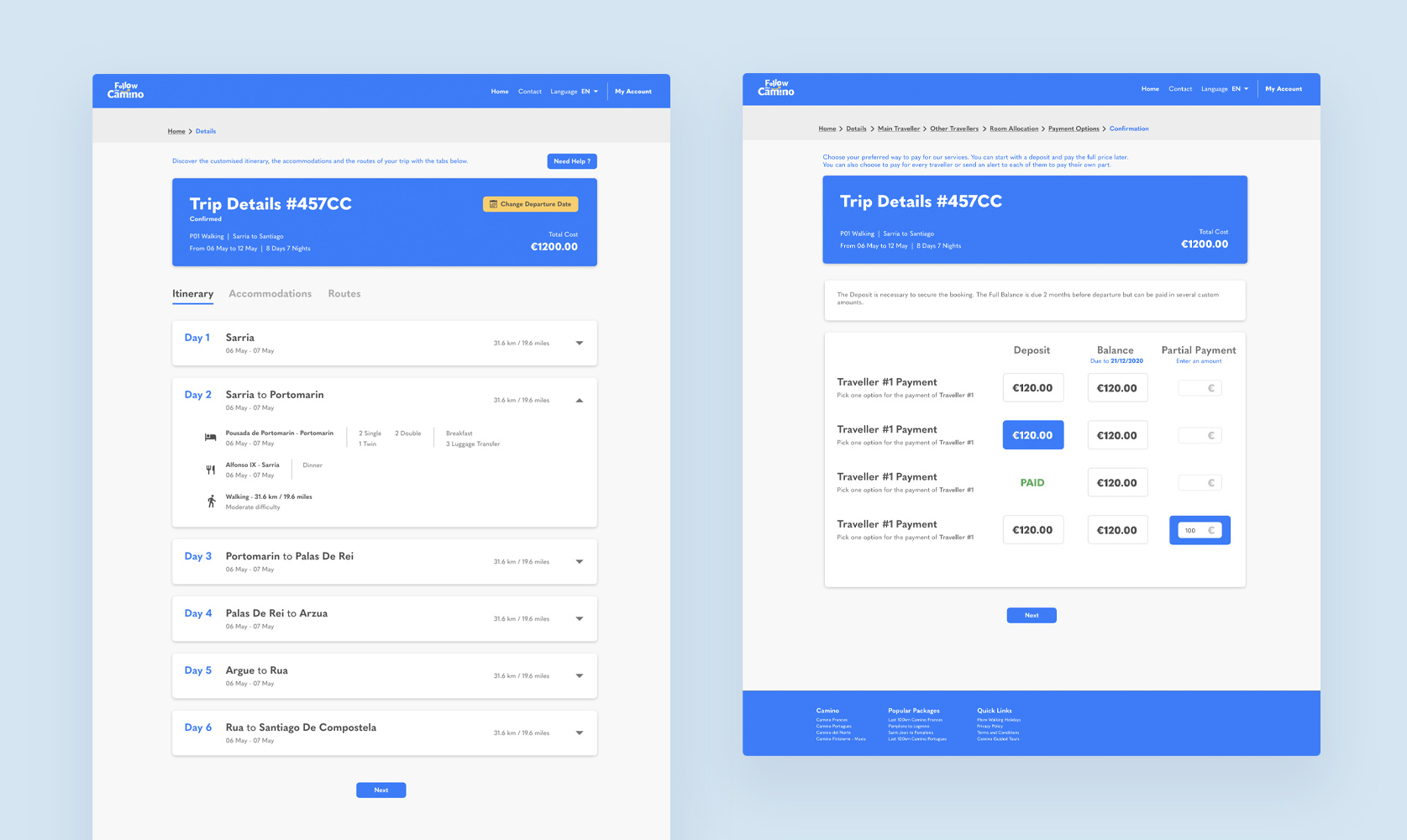
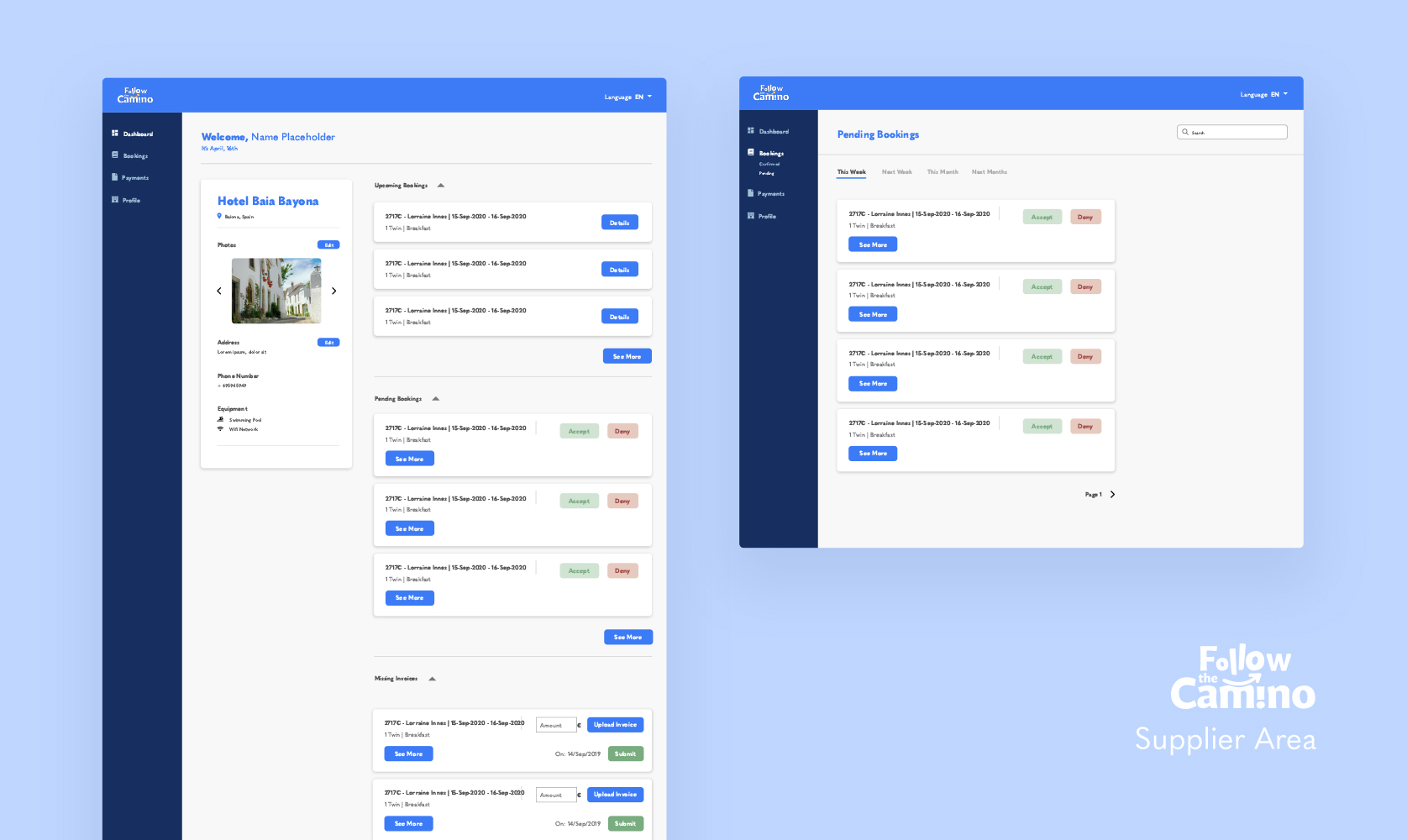
This work was used as a foundation for a UI redesign for their supplier area, this area is used by the accomodations they are collaborating with to book their customers. The process was quicker because of time, however a similarity of assets and design helped to gain some time while retaining consistency between the 2 areas.